L&Q, Saxon Reach, Branding, Launch Campaign & POD
A sleek, effective marketing campaign, complete with marketing suite graphics for L&Q Counties.

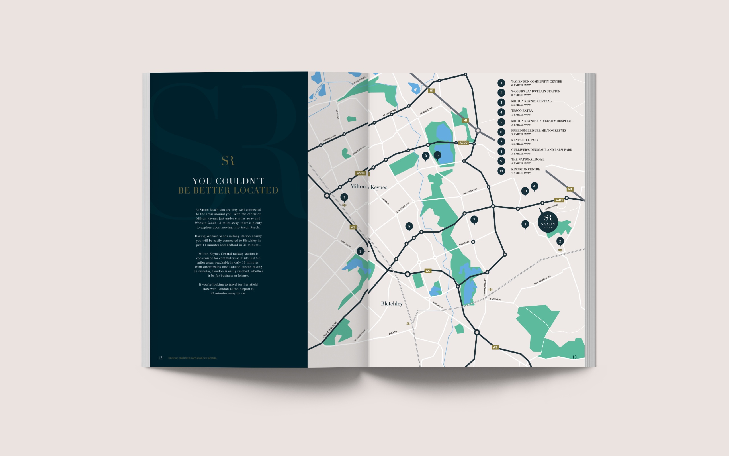
Saxon Reach is a new build development in Wavendon, in the outskirts of Milton Keynes. Providing a collection of one, two, three, four and five bedroom houses all built to a high specification, homes are available through private sale and Shared Ownership.
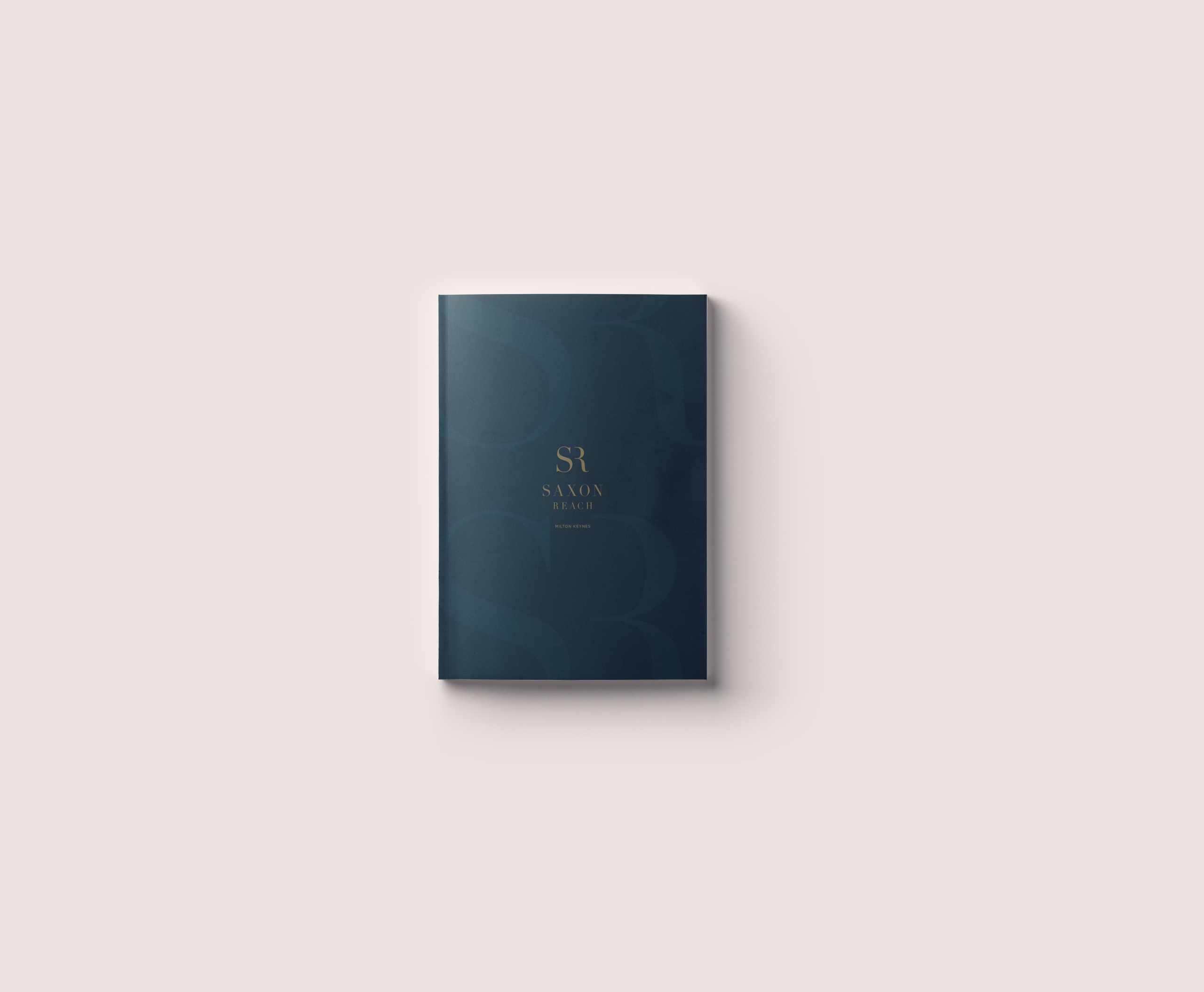
Being a new development within a new community close to Milton Keynes, the branding needed to combine a simplistic but unique and stylish flair to really portray the high specification homes within the development.
Once the bespoke branding had been established, we began to construct an array of marketing collateral, from media, literature, signage and marketing suite graphics in order to create a consistently strong and effective brand image.

Working alongside the Spaces team, we were tasked with developing a marketing suite POD that encapsulated a contemporary style to give a stylish feel to the development. The blended use of slate blues and gold throughout the marketing suite provides a sophisticated atmosphere as soon as you walk in, with the large Saxon Reach logos on several walls of the POD helping tie the entire room together. Inside the glass meeting room, we also worked with the Spaces team to produce photo frames showcasing local photography of the surrounding Milton Keynes area and interior home CGIs to truly give a homely environment.
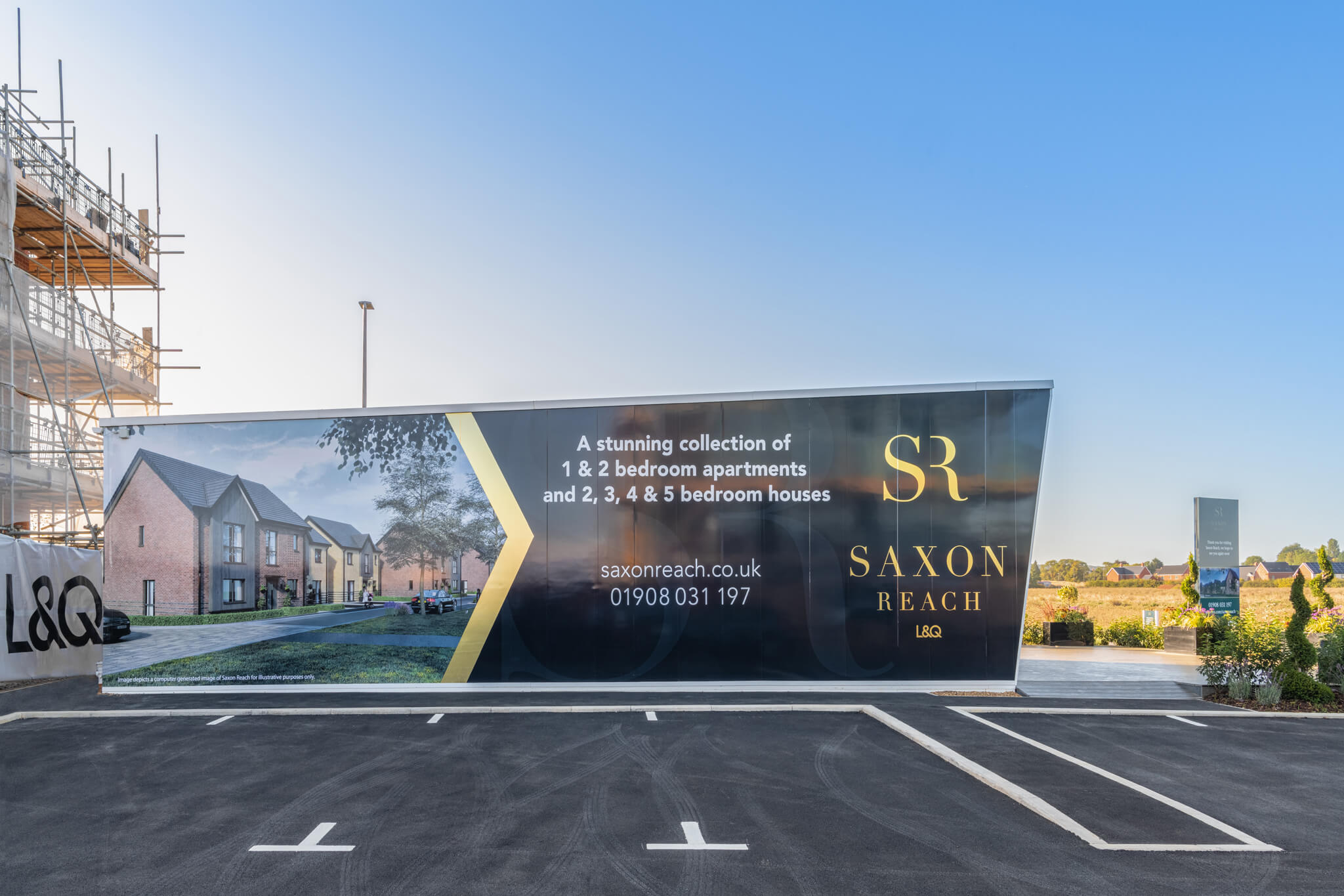
Being on a large development, it is imperative that potential customers are easily directed to the marketing suite. We therefore produced several elements of signage for outside the POD, from a large stack sign to swing boards and wallboards containing key information on the Saxon Reach development and developer, L&Q. All signage looked to include the core L&Q brand colours and gold Saxon Reach logo.
Additional to this, we produced a host brochure printed on soft touch laminate and incorporated the brand slate blue and gold colours throughout. This included a pouch on the back inside cover to hold documentation and relevant inserts to give a different style of brochure.
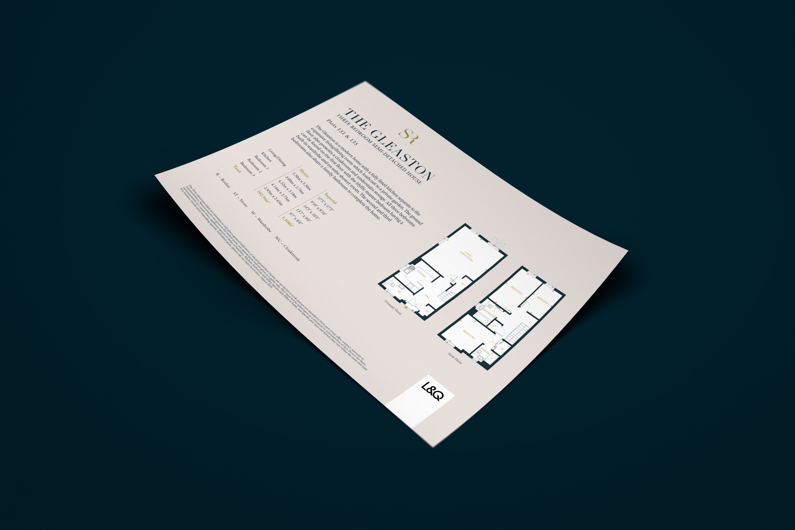
For the floorplans, rather than producing a brochure, we instead produced individual A4 inserts for each housetype for all tenures to make it easier for customers to view the specific tenure/housetype they’re interested in.
Each housetype insert was double sided, with a detailed property CGI on the front and full floorplan and description on the back, printed in Matt 200gsm.