Metropolitan, Clapham Park, Marketing Suite And Show Home Design
The marketing suite and show home design at Metropolitan’s Clapham Park development.
Contact Us
Clapham Park
Metropolitan
Clapham, London
October 2018

Presented with an existing space situated opposite the largest expanse of the regeneration of Clapham Park, the team was asked to not only create a space for potential buyers, but also for the surrounding community. Due to the build programme, the sales team would not have a physical show apartment to walk the customers around for a few months. Therefore a mock area needed to be created showing not only the specifications but also the lifestyle the development offers.
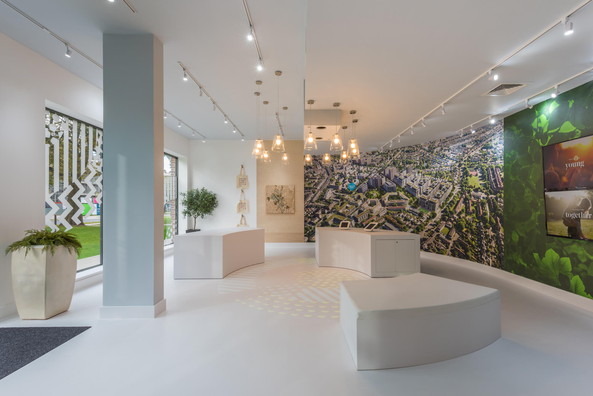
Within the discovery zone is a mixture of 3D architectural models, imagery, large video wall, and floor projection. Working alongside the branding agency, Better, the colourful logo was used as a base for this area, using the circle to denote the space and shapes. As the phases move on and the logo colours change, so can the projection.


As the existing space was a blank canvas it aided the design as there was complete freedom to work the interior to the customer’s needs. Using pure white resin throughout the space allowed us to not only future-proof the design for new phases and brand colours but to also direct the visitors’ attention to the mock area.
The interior is split into three zones; the discovery area, the sales office, and the mock area. Building in the mock area to the exact size of one two-bedroom show apartment allows the buyers to visualise themselves in the living space.
To ensure that all elements were covered a false balcony space was added with a living moss wall and gardening trough to emulate the feeling of being outside. The sales team are also encouraged to use the show apartment to hold some of the conversations, therefore creating an immersive experience.
Within the discovery zone is a mixture of 3D architectural models, imagery, large video wall, and floor projection. Working alongside the branding agency, Better, the colourful logo was used as a base for this area, using the circle to denote the space and shapes. As the phases move on and the logo colours change, so can the projection.